Sous Chef
A recipe app that prioritizes cuisines and allows users to filter based on their preferences.
Project Date: October 2021- December 2021
My role: UX/UI Designer, UX Researcher, Wireframe, Prototype
Slide title
Button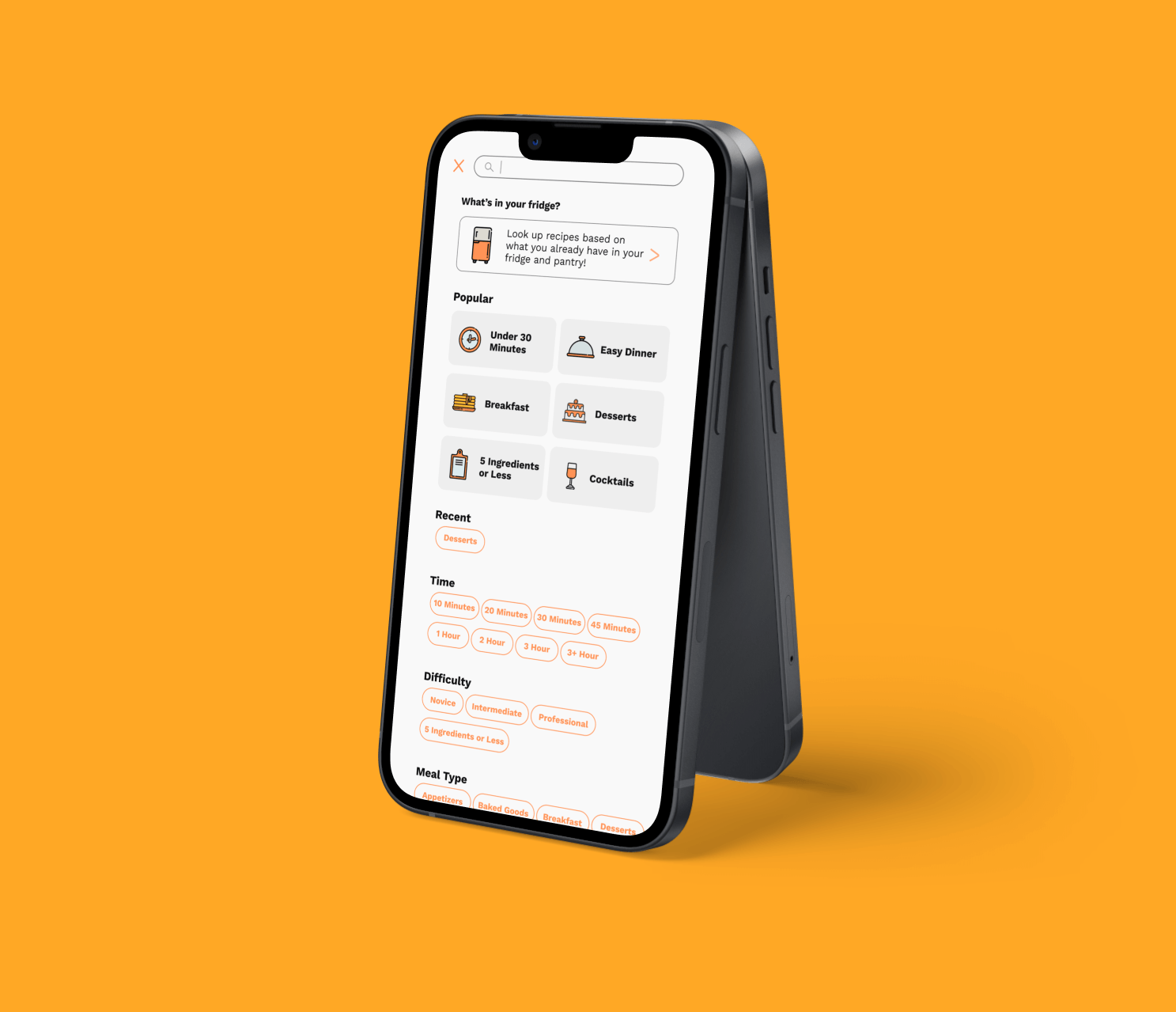
Slide title
Button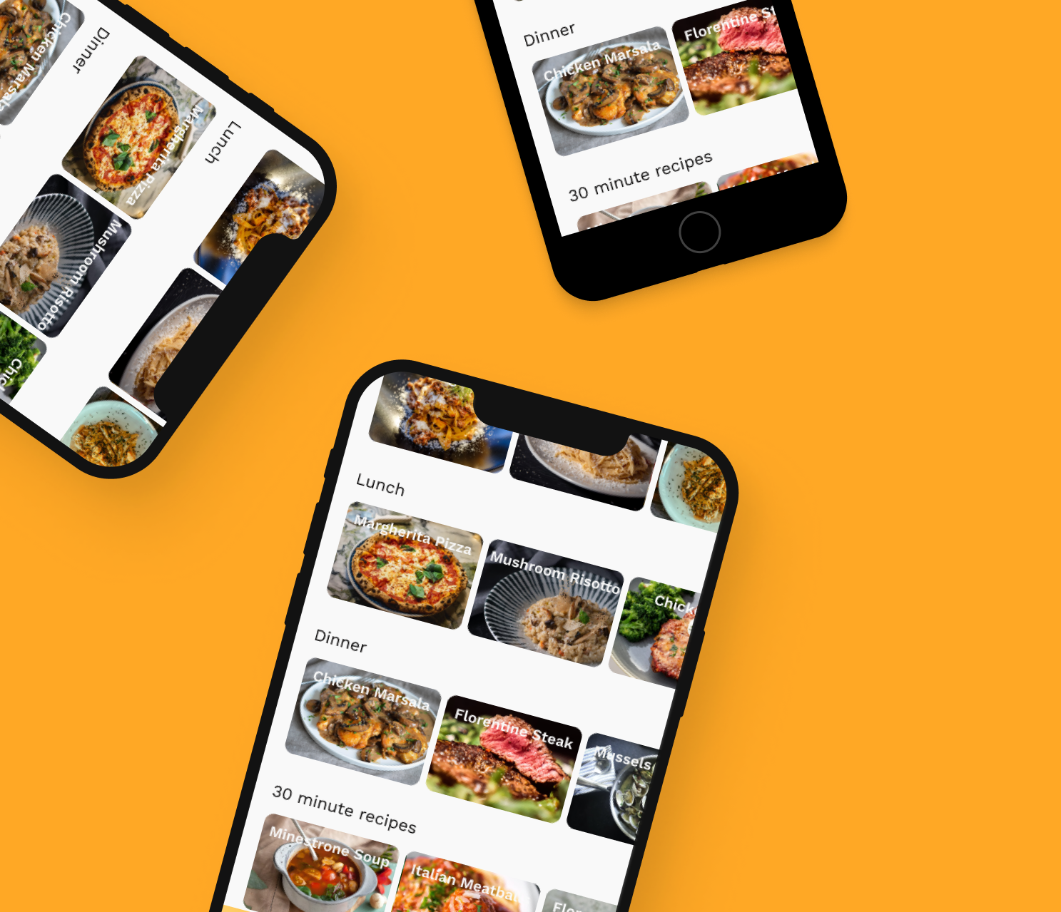
Slide title
Button
About the Project
Have you ever wondered, "I'm in the mood for Italian tonight. What should I make?" and went online to search for a recipe but soon became overwhelmed with the thousands of results? Sous Chef aims to alleviate the stress and time of searching for recipes based on cuisines so users can have an easier cooking experience.
The Challenge: Make searching recipes easier. In this case, I designed an app based on cuisines and filtering through further. I also added the feature of being able to search for recipes based on what ingredients users already have available in their homes.
Objectives: Create an easier way to search through recipes through the lens of specific cuisines to create a seamless cooking experience to alleviate the stress and time of searching.
Define
Research Goals
I wanted to understand if searching and filtering by cuisine first would be useful and effective. I also wanted to see if the filters were effectively helping users find the right dish for them.
Research Objectives:
- Understand how users use the app.
- How often do users have a specific recipe in mind vs looking for something new to cook.
- What is the process of searching for a recipe?
Methodologies:
- Secondary and competitor analysis to see what the market has to offer.
- User interviews with a target audience of young to middle aged professionals and gather perspective on how much time they spend cooking daily.
Participants:
- Males and females ranging from their 20's to 50's who work and cook their own meals.
Secondary Research
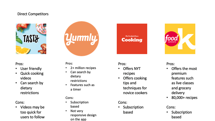
It was important to look at other recipe apps and see how they set up their searching process. I chose companies that are established in this field, such as Tasty, Yummly, NY Times Cooking, and The Food Network.
Findings: All of these apps offer a large variety of recipes with plenty of filters to search through. Tasty and The Food Network have affiliations with grocery stores where you can add ingredients to the "Cart" and purchase them for pickup/delivery at their partnered business. However, 3 out of the 4 competitors offer their premium services based on subscriptions, which may not be accessible for every one. The user interface can also be a bit cluttered and overwhelming, particularly on Tasty, making it taxing on the eyes to navigate through.
Takeaways:
- Simplify the searching process and recipe layout.
- Provide a diverse set of filters for users to choose from.
- Allow users to save and store all their recipes in one place for future reference.
User Interviews
The target audience is males and females ranging from their 20's to 50's who work and cook their own meals.
Findings:
- All participants state they were busy with their careers and want to worry less about what they're cooking for the day.
- All participants expressed interest in trying out new cuisines and wanted the "total time to cook" be displayed more visibly.
- All participants stated importance in healthier recipes and would enjoy a way to filter by dietary restrictions.
User Persona
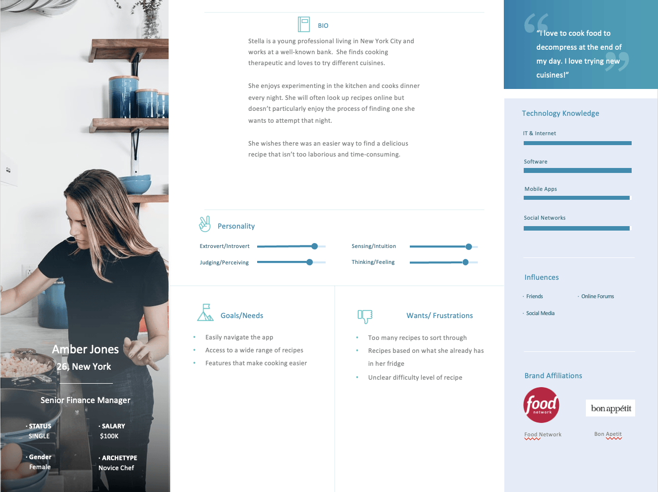
Amber is a young professional in NYC who enjoys cooking but really only has time to delve into it for dinner. She's looks for recipes from different cuisines based on what she's craving but does not enjoy the laborious process of searching for what she wants to try that night. She is tech-savvy and enjoys simple layouts that make it easier to consume information.
Ideate
User Flow
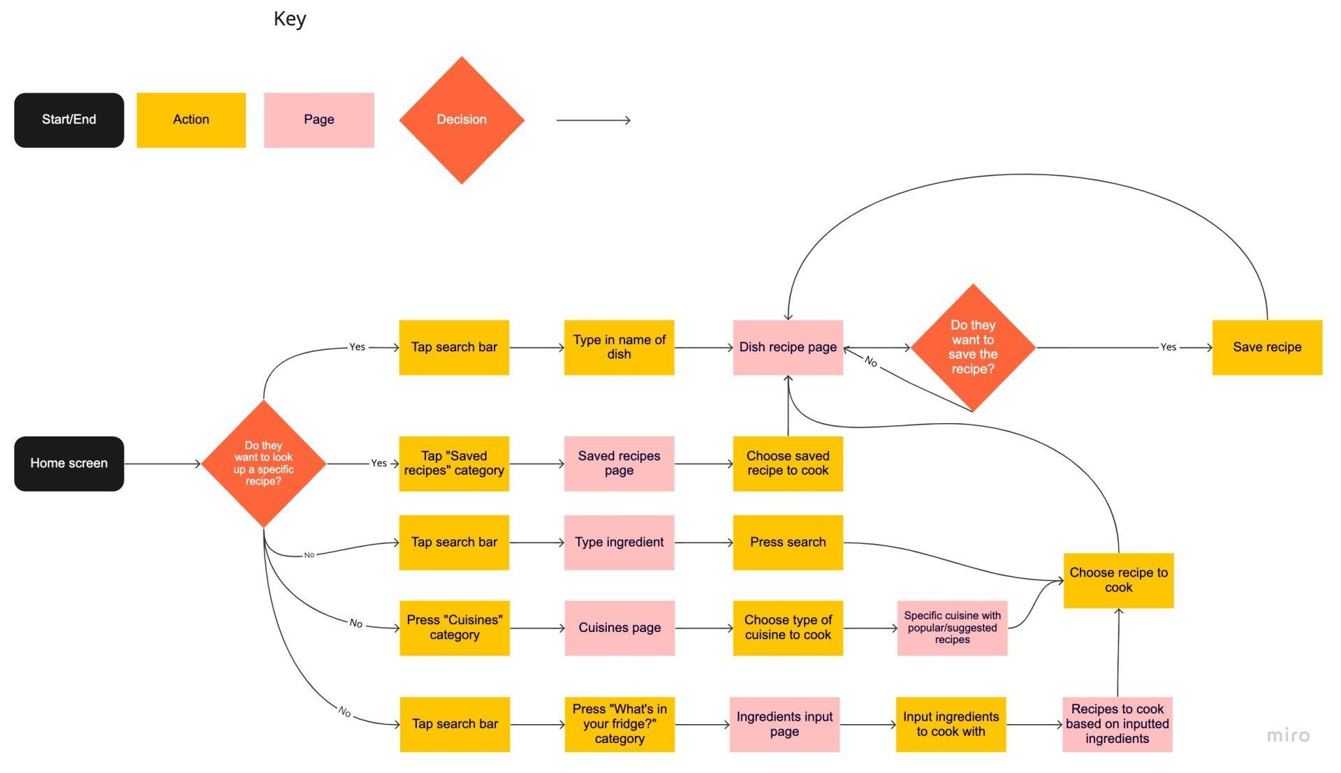
This user flow showcases how a person would interact with the app that leads to eventually finding a recipe to use.
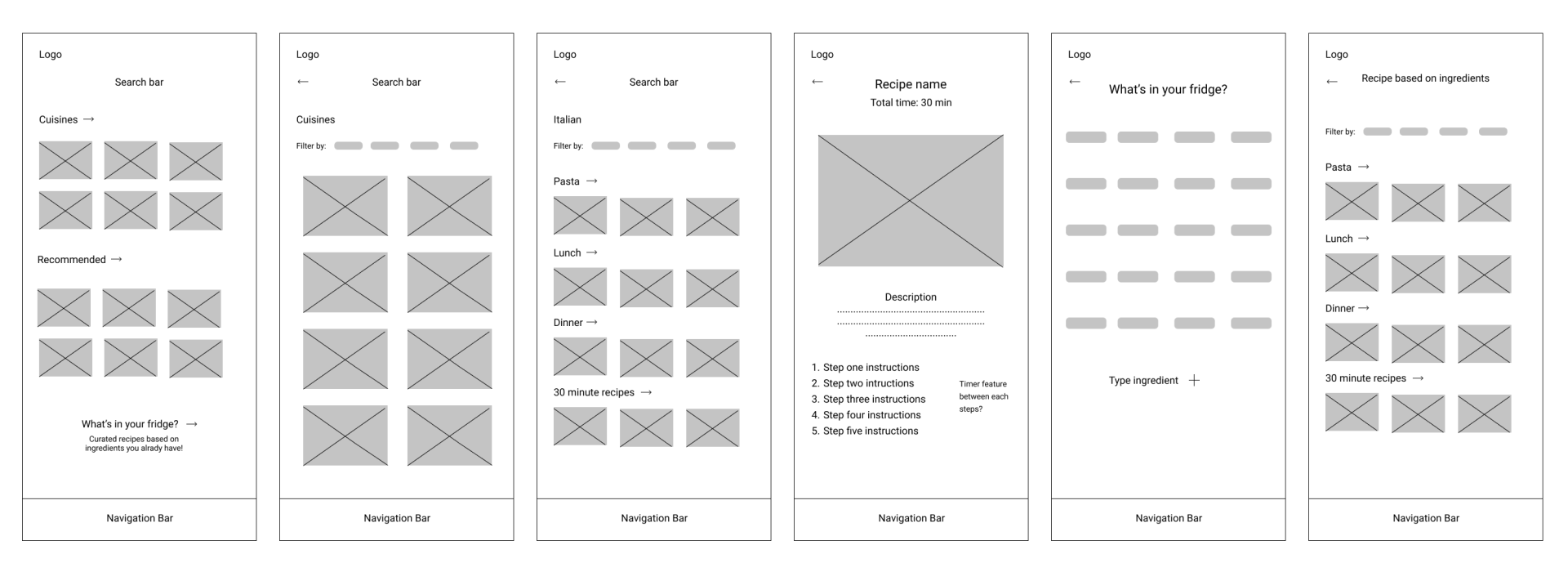
Wireframes
This was my first iteration of the app, keeping the user feedback in mind.
Design
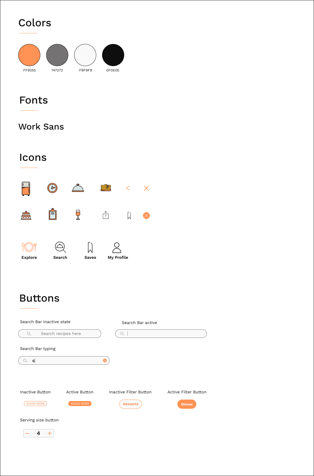
Branding
I wanted this app to excite and engage the user with a bright pop of color without being too overwhelming. I chose orange as the primary color because it elicits feelings of excitement and optimism.
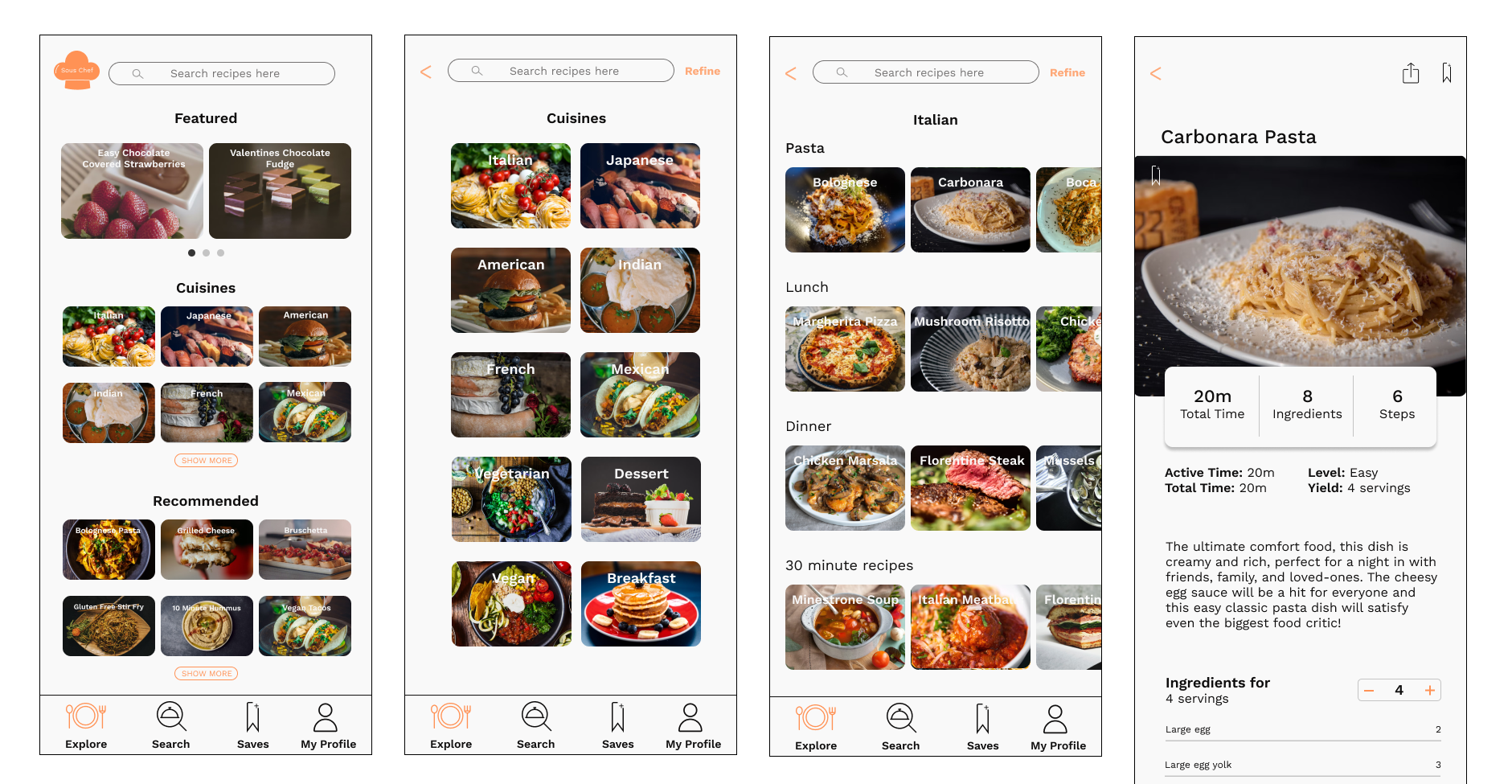
Refining the Design
I decided to make some changes to the original wireframe layout to elevate the design while still keeping the needs of the users in mind.
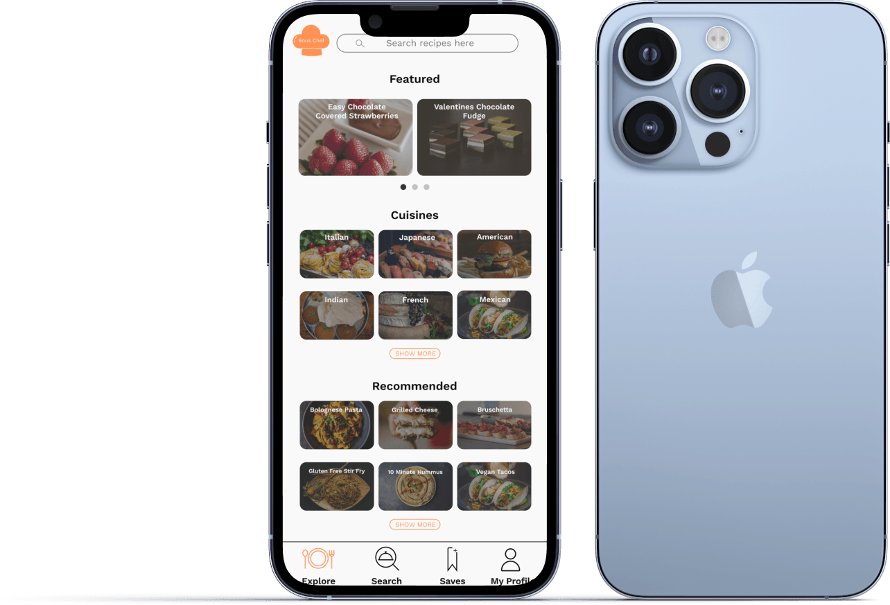
Prototype
Check it out!
Testing
Usability Testing
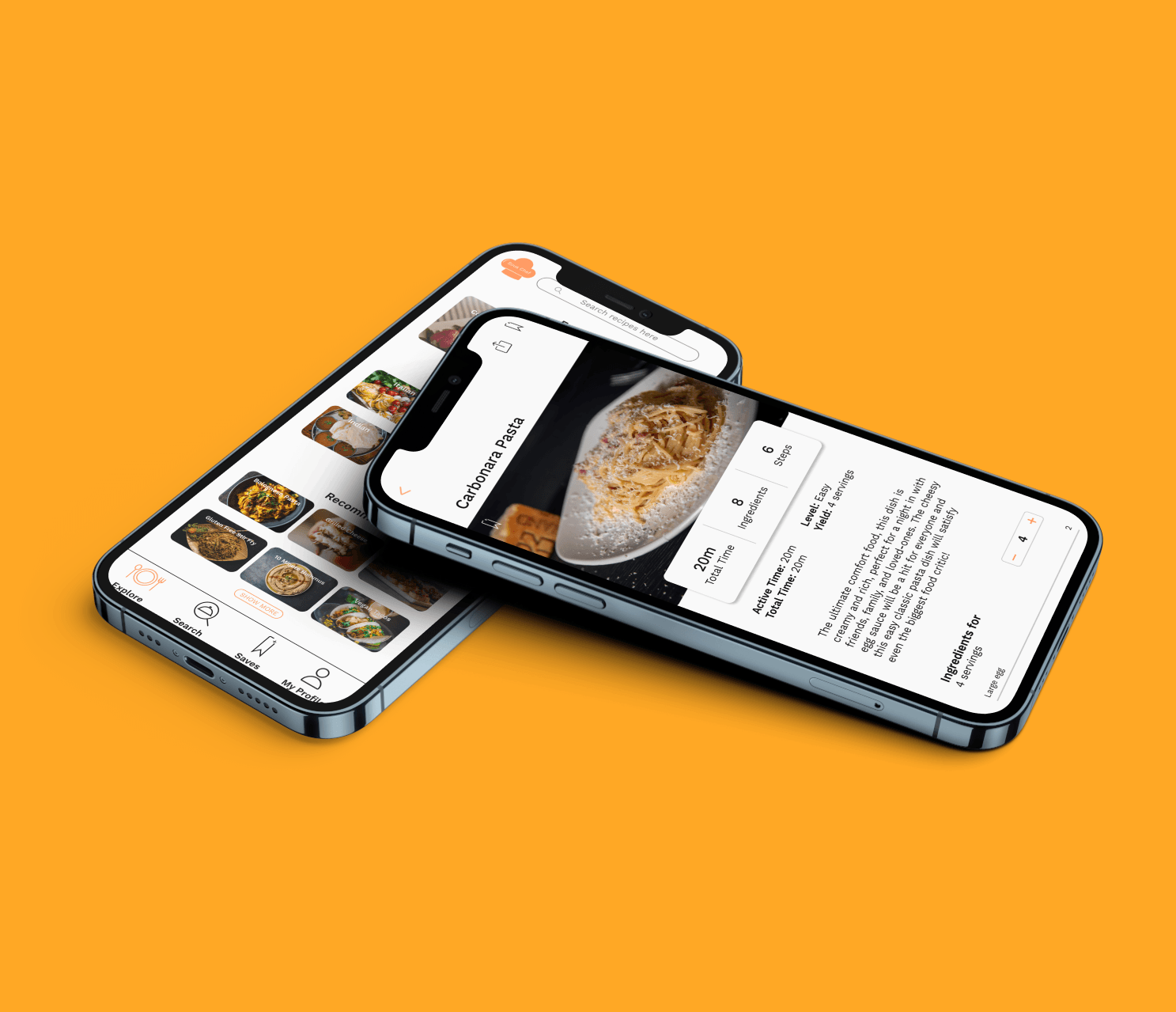
I recruited users ranging from their 20's-50's to test out the design functionality and ease of use to finish the task "Find a recipe for Carbonara". I asked them to talk aloud during their process to get their insights.
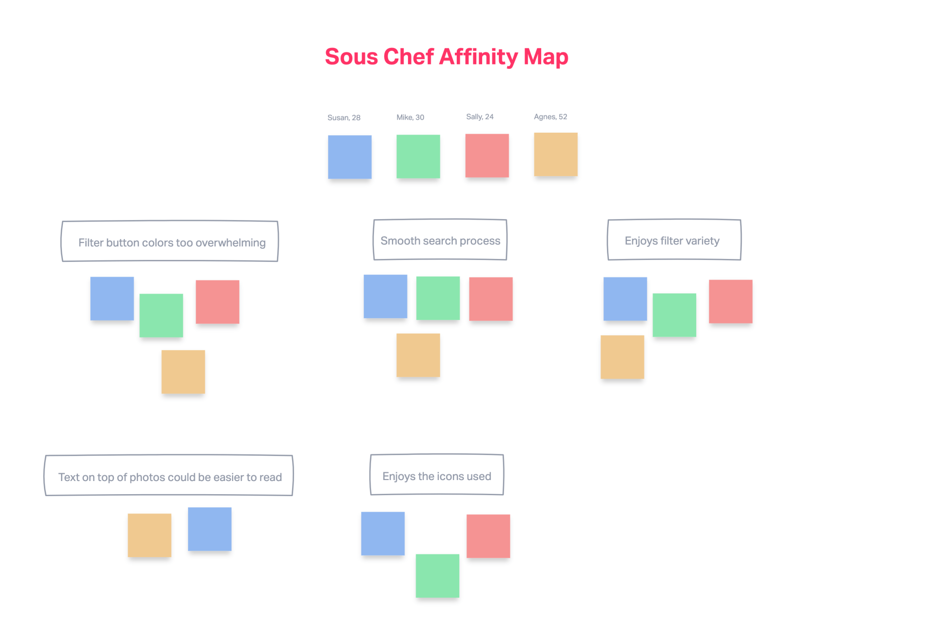
Affinity Map
I created an affinity map based on the feedback received to organize the common topics brought up.
Iterate
Revisions Made
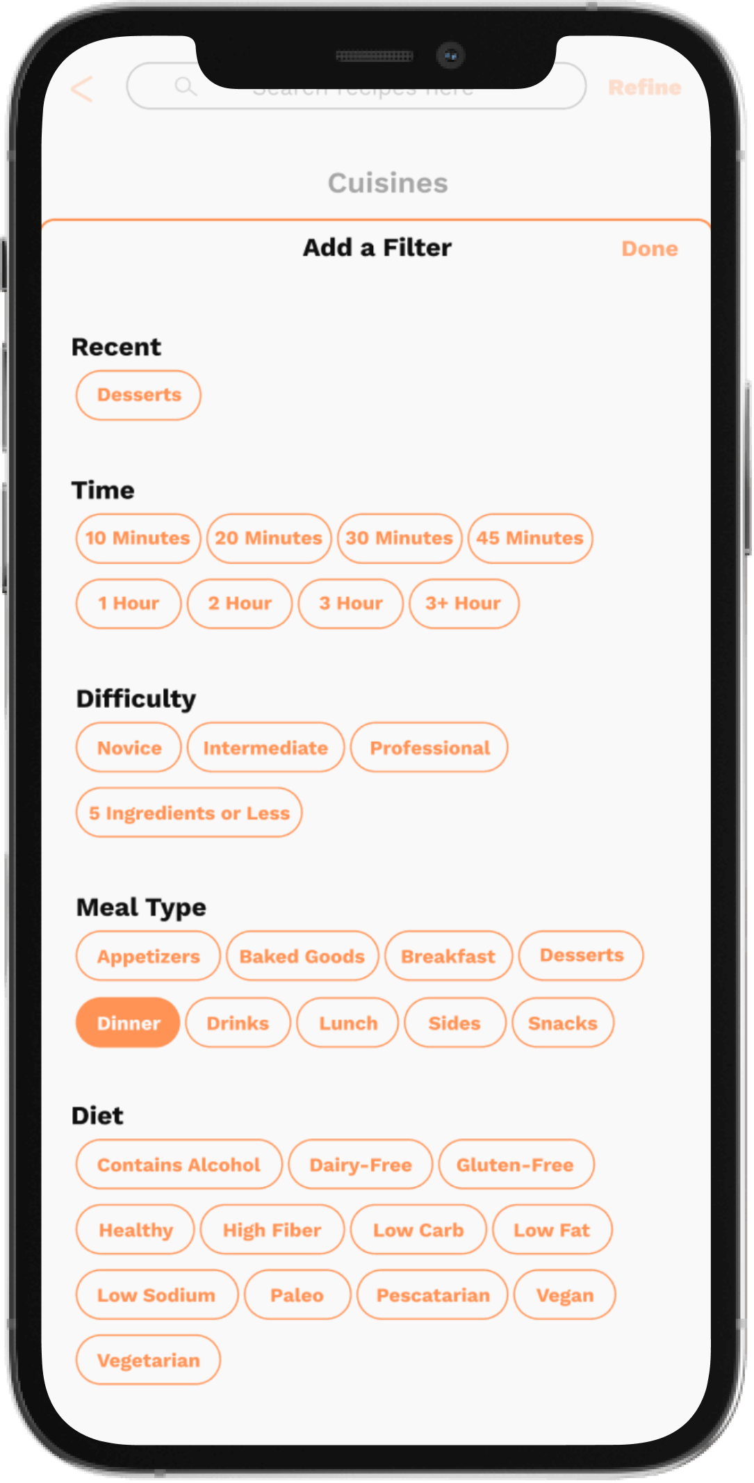
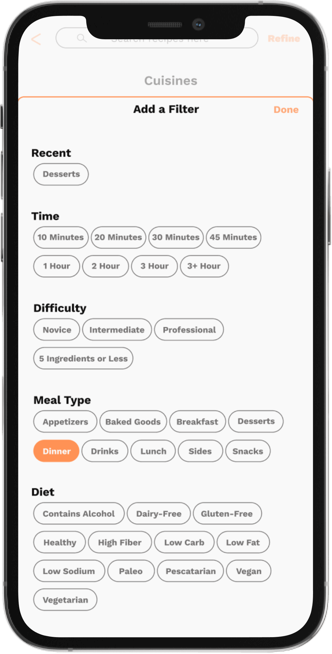
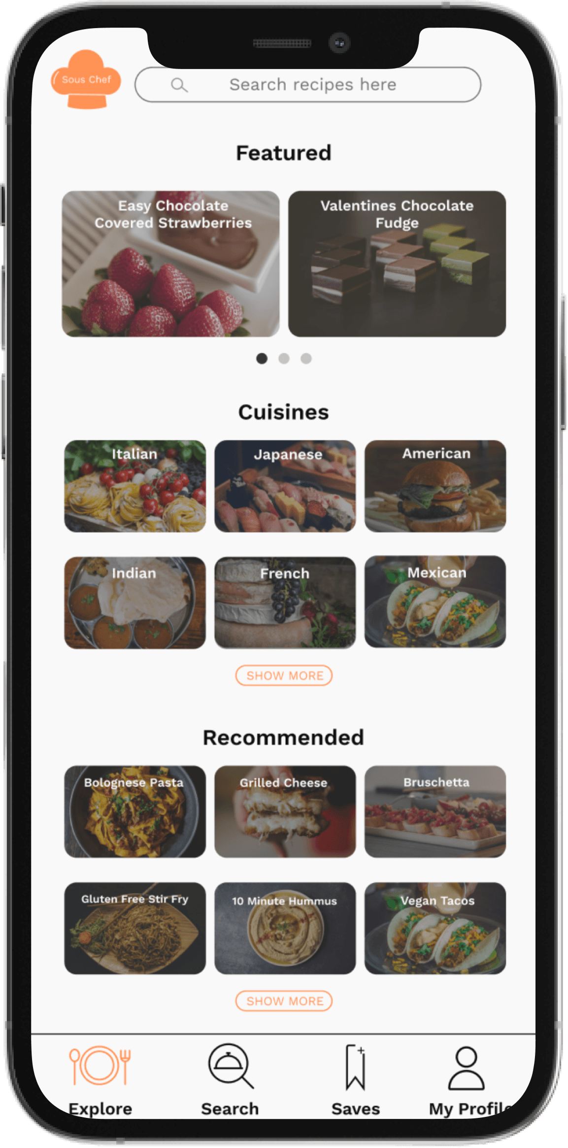
I changed the filter button colors from orange to a dark grey so it doesn't overwhelm the user with all the choices.
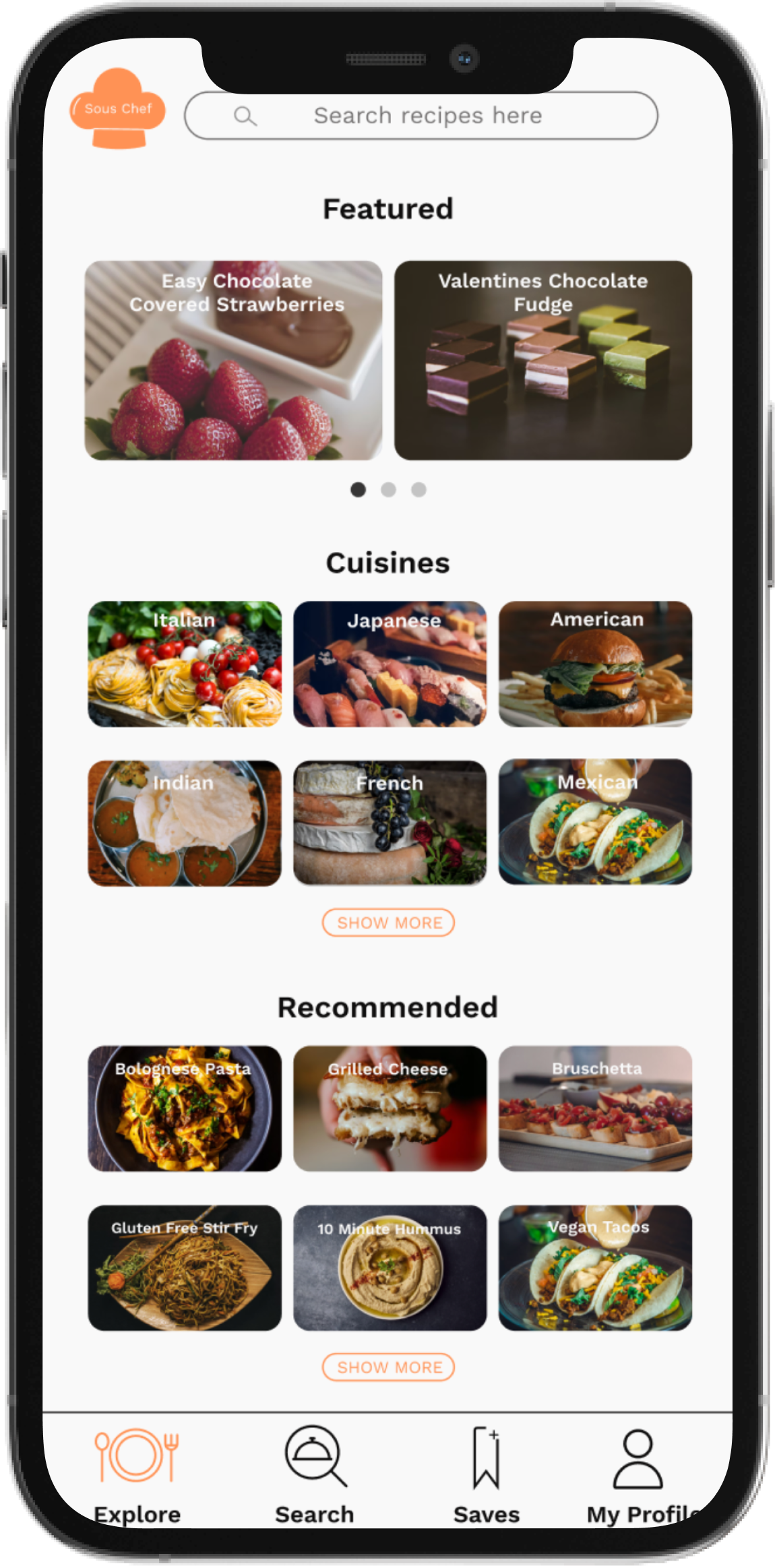
I added an overlay to the cards in order to make the text easier to read.
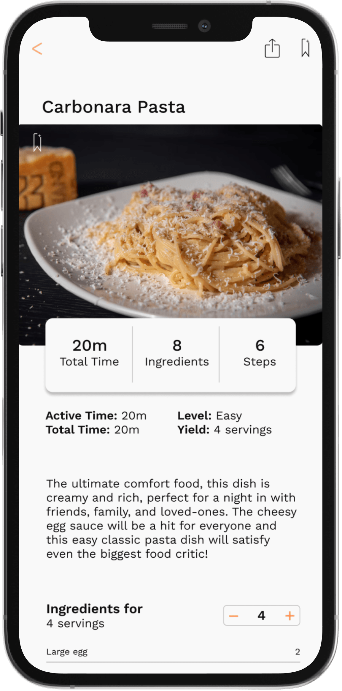
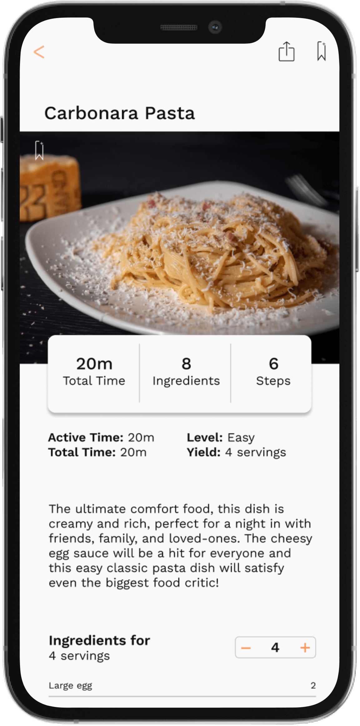
I also made the Carbonara photo straight instead of curved to get rid of the small white space at the corners of the picture.
Conclusion
Thoughts:
Overall, I received positive results from users and they were able to complete the task I laid out for them with ease. This was a challenging project to complete because of the amount of information and components required. This was a great learning experience and I was able to greatly improve on my skills, particularly prototyping. It was a great experience seeing users interact with my product and it encourages me to continue to think deeply about my intentions and keeping it about the human experience.
Future Considerations:
I would test this more often and build out more features, such as instructional videos, a timer function, and grocery lists to continue to make it a more centralized app for home cooks.


