Kote
A
responsive women's clothing
e-commerce website
Project Date: April 2021- May 2021
My role: UX/UI Designer, UX Researcher, Wireframe, Prototype
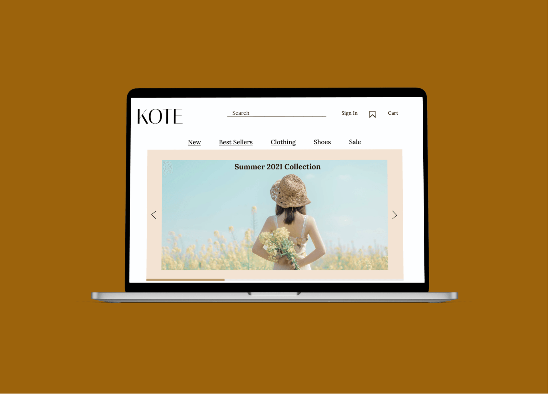
Slide title
Button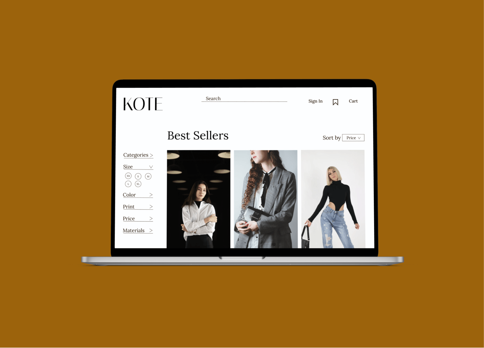
Slide title
Button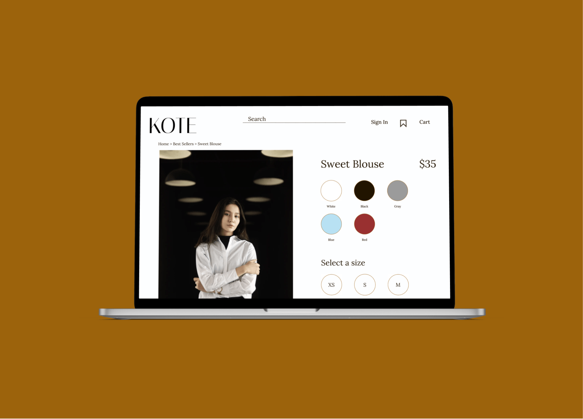
Slide title
Button
About the Project
Kote is a women’s clothing retail company that has over 400 stores in over 32 countries. Their clothes are fashionable and at an affordable price.
The Challenge: Create a responsive website and rebrand the company where customers can buy clothes online.
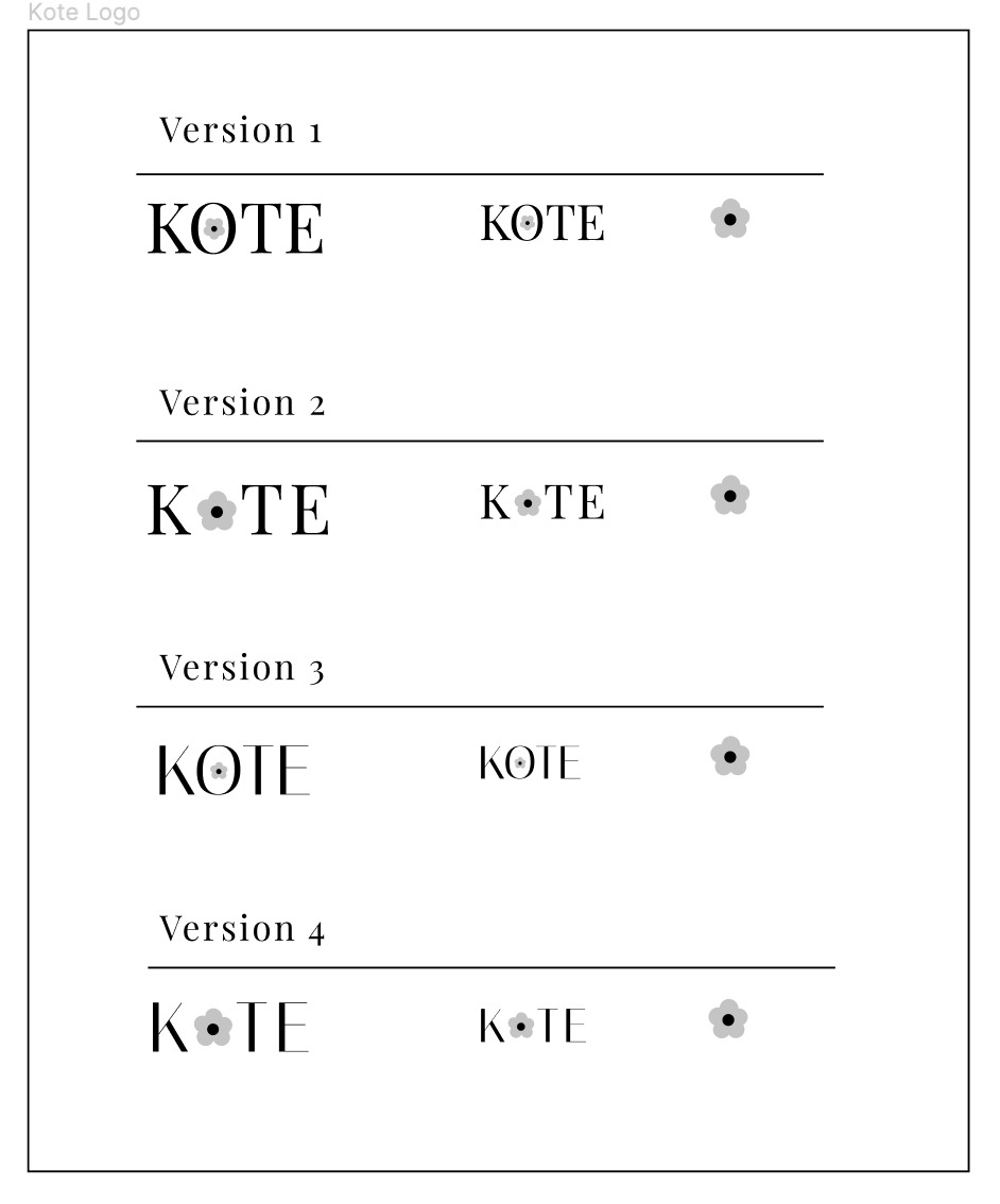
Objectives: Rebrand the logo and create a responsive website with filters and search function to establish Kote as a fashion forward and modern company.
Define
Research Goals
We want to understand why customers shop online and what value they find in this digital experience so we can create an appealing online website to expand Mirror’s customer base.
Research objectives:
Understand why customers choose to shop online vs. physical stores.
- What makes the online experience attractive to consumers?
- What is the shopping process online and are there bumps in the process where people drop off?
Methodologies:
- Competitor analysis to see what the market has to offer and what their buying processes are like.
- User Interviews with a target audience to see their perspectives and gain insight on what attracts them to certain brands and websites over others (3-5 people).
- Secondary research from articles and other literature to gain a better understanding of the online retail space and see if there are patterns of success.
Participants:
- Females ages 18-50 who have shopped online in the last 12 months.
Assumptions/Risks:
- An assumption we can make is that shopping online is more convenient for many people than going to a physical store and buying it from there. Another assumption is that filters will be used heavily when searching for clothes, such as size, color, and type of clothing.
Secondary Research
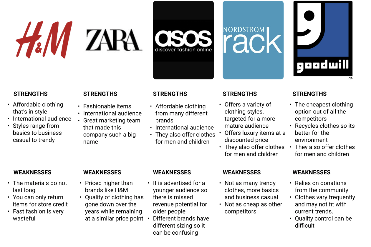
It was important to begin research for Kote by understanding its direct competition in order to understand how the shopping experience looks and feels for their users when shopping online. I chose brands that are at a similar price point and have a strong physical and online presence, such as H&M, Zara, and Asos. I also chose Nordstrom Rack and Goodwill as indirect competitors because they have stronger physical store presence vs their online presence to understand if their web encouraged shopping in person.
Secondary Research Findings:
I found that simple navigation and clear placement of information and icons make the shopping process easier for the user. Too much information and banners make the screen seem too cluttered and discourage users from reading them/continue with the checkout process.
Takeaways:
- Make the process simple and clear
- Provide useful filters and search function so users can find products faster
- Allow for users to
save products so they can come back and complete their purchase at a later time
User Interviews
The target audience are women ages 18-50 that have shopped online in the last 12 months. I interviewed 3 peers about their experiences and a summary is provided below.
- Sarah (24) Baltimore, MD
- Angela (20) Bryn Mawr, PA
- Lauren (26) Los Angeles, CA
Findings:
- All participants found the online shopping experience more convenient over shopping in the physical store.
- All participants said search, filters, and reviews were important to their shopping experience.
- All participants noted they can find better deals for the products they want online and it’s convenient to see the entire inventory vs seeing limited stock in stores.
User Persona
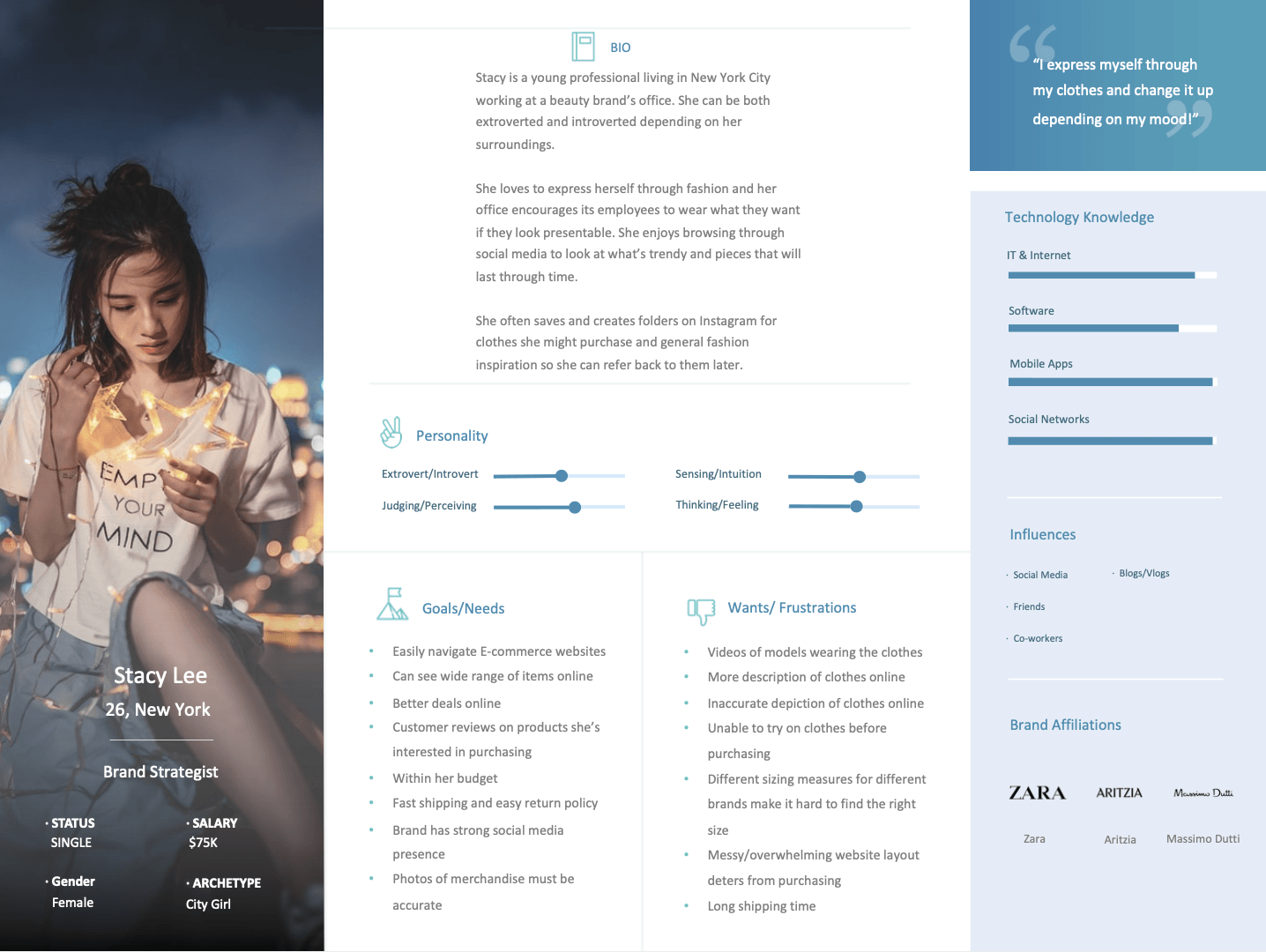
Through the interviews, I was able to narrow down the specifications I needed for a user persona for this project. Stacy is a 26 year old Brand Strategist working in New York and loves to express herself through her clothes. She is tech-savvy and frequently shops online and browses through social media to keep up with trends and get inspiration. She enjoys looking on sites that are clean and easy to navigate, provide accurate photos of their products, and can read through customer reviews.
Project Goals
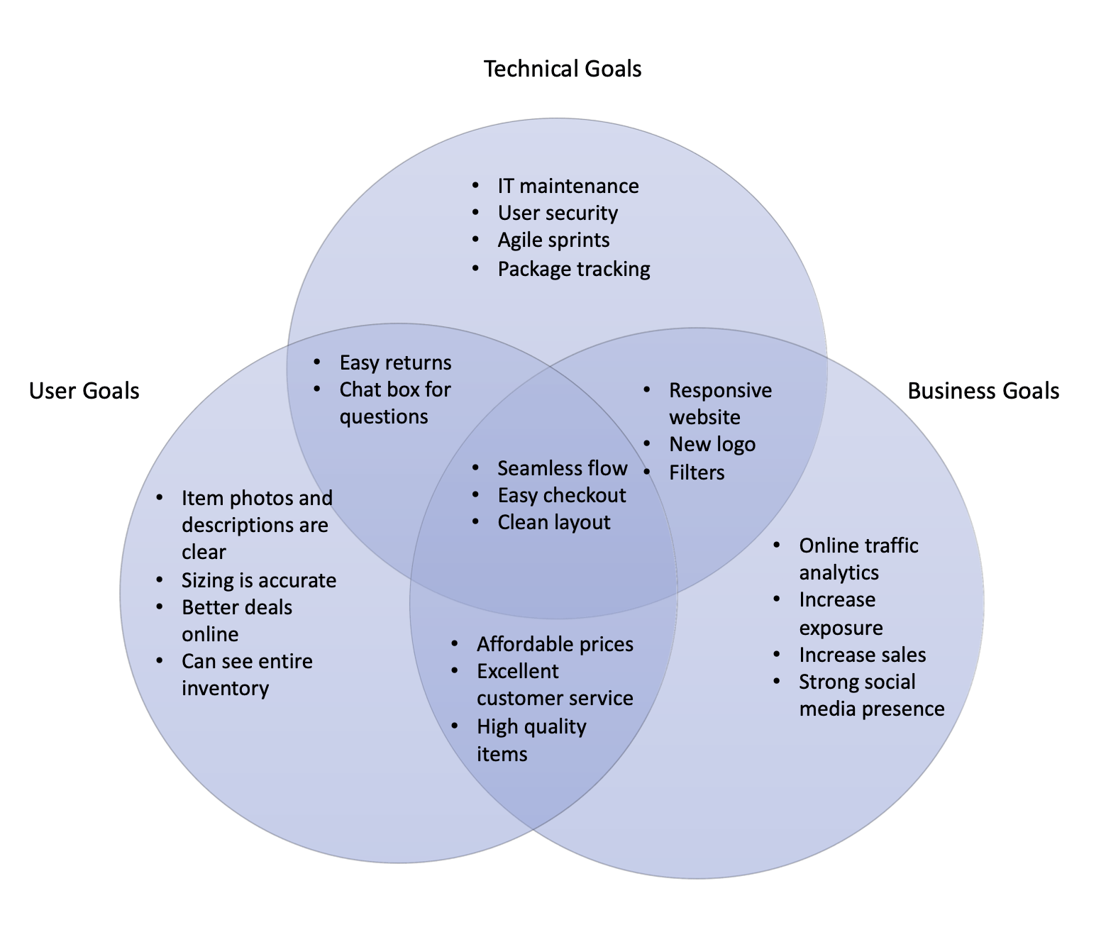
I created project goals to identify where there are similarities, differences, and overlapping goals for the business, user, and technical side of the project. These are important stakeholder information that would define the project so it was essential to have a good understanding of them. In the case for Kote, a seamless, clean, and easy checkout flow was essential and a common interest for all the goals.
Ideate
Card Sorting
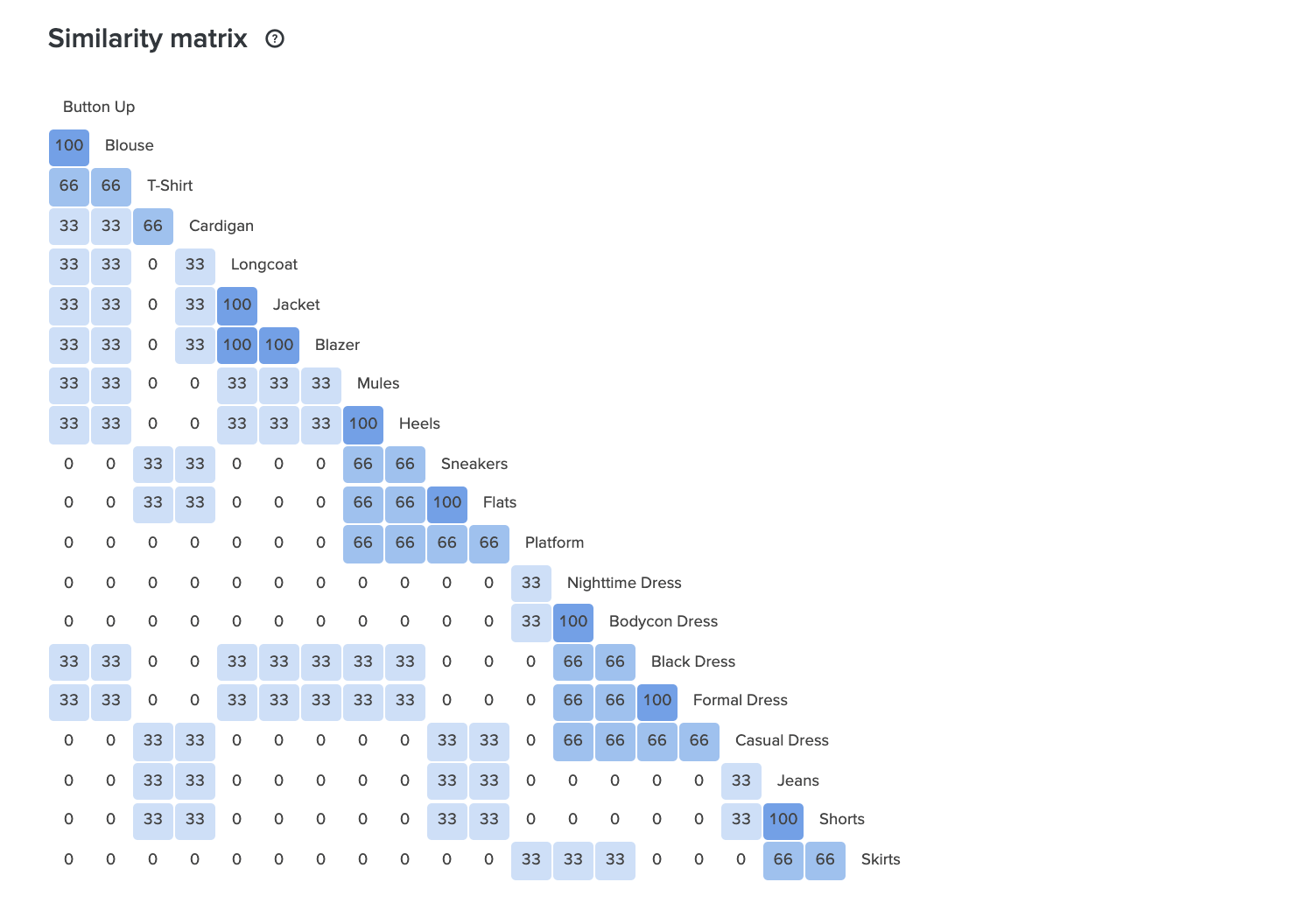
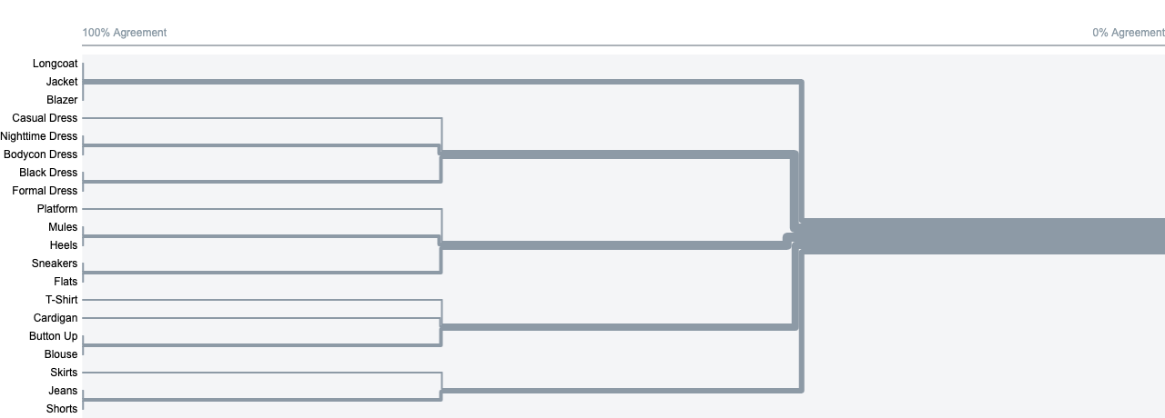
Since I was creating an e-commerce shopping site, it was important to understand how the users would categorize the clothing items that would be offered on the site. I used OptimalSort to do a card sorting exercise and asked 5 participants to create their own categories. I utilized the categories the participants created in my website.
User Flow
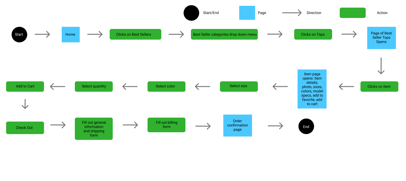
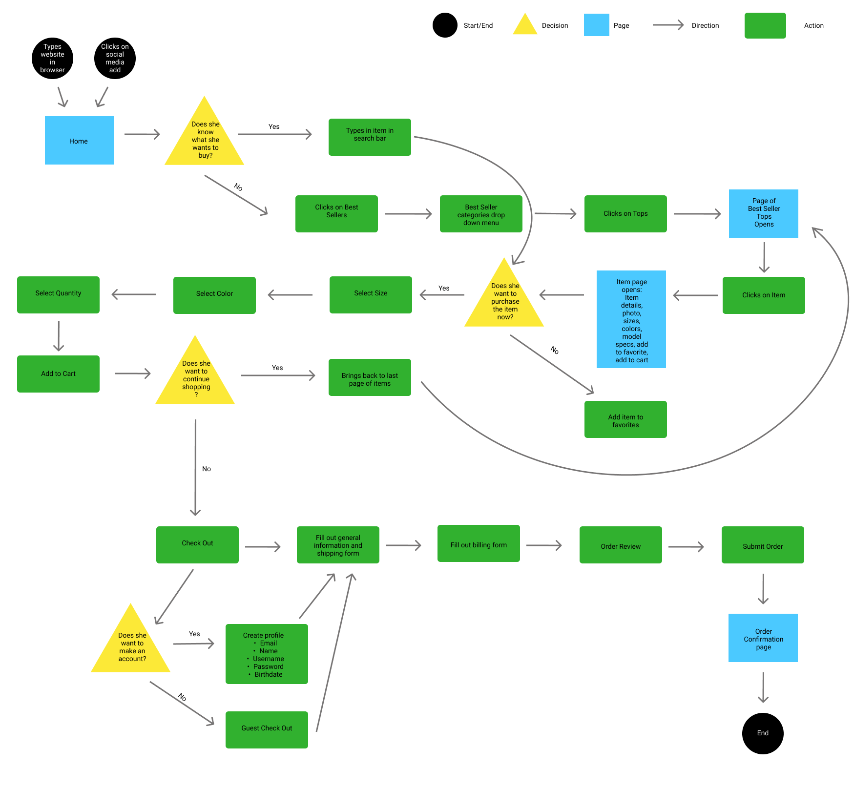
I created a more in-depth user flow to showcase multiple ways a user would interact with the webpage that leads to a checkout.
Wireframes
After my user research and testing, I gathered all the data and feedback to create some low-fidelity wireframes and built out the pages for the final product.
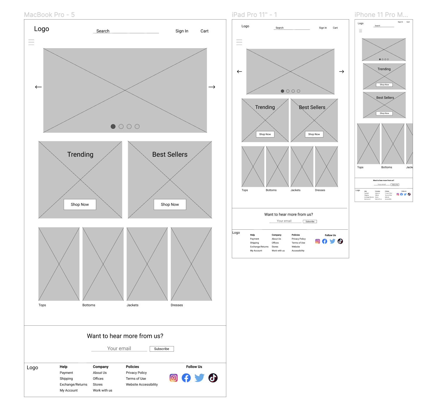
Refining the Design
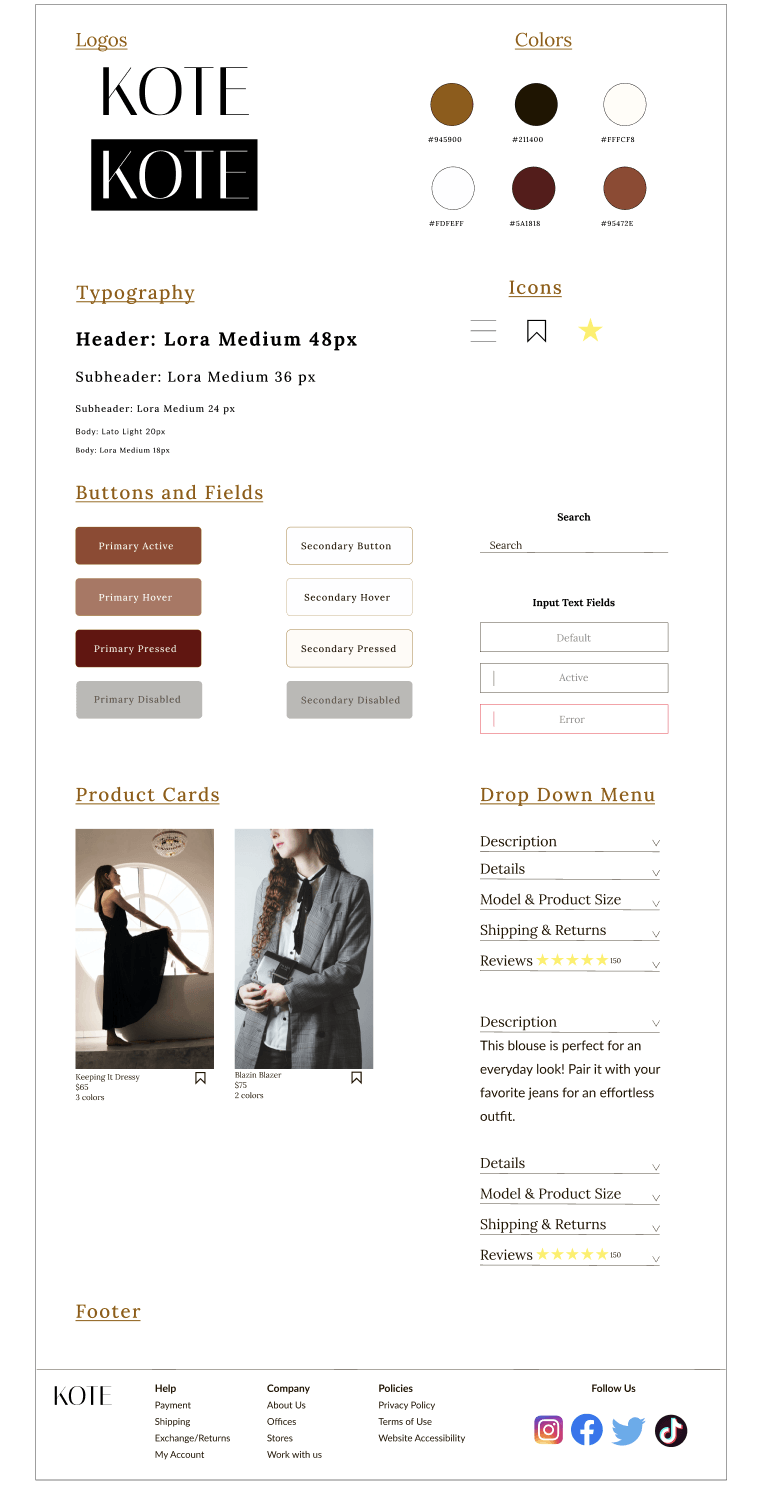
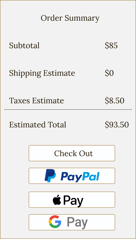
I made the final touches to the wireframes and created a high-fidelity mock up and prototype of the gifting and checkout process feature. You can check it out below!
Prototype
Check it out!

Testing
Usability Testing
With the prototype complete, I needed to confirm the design’s functionality and ease of use. I recruited 3 users in the age range from 20-50 to test out the site and give their insights. I assigned them the task and to talk about their thought processes aloud while completing the task.
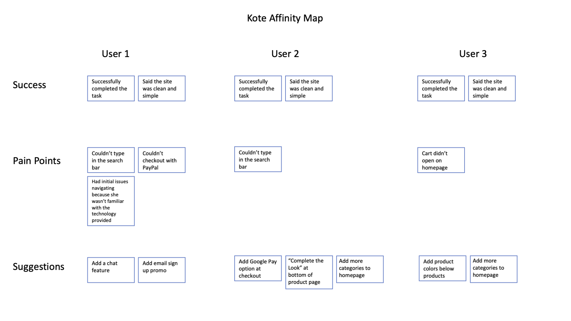
Affinity Map
Based on the feedback from the user interviews, I created an affinity map to make the necessary changes to the project.
Iterate
Revisions Made
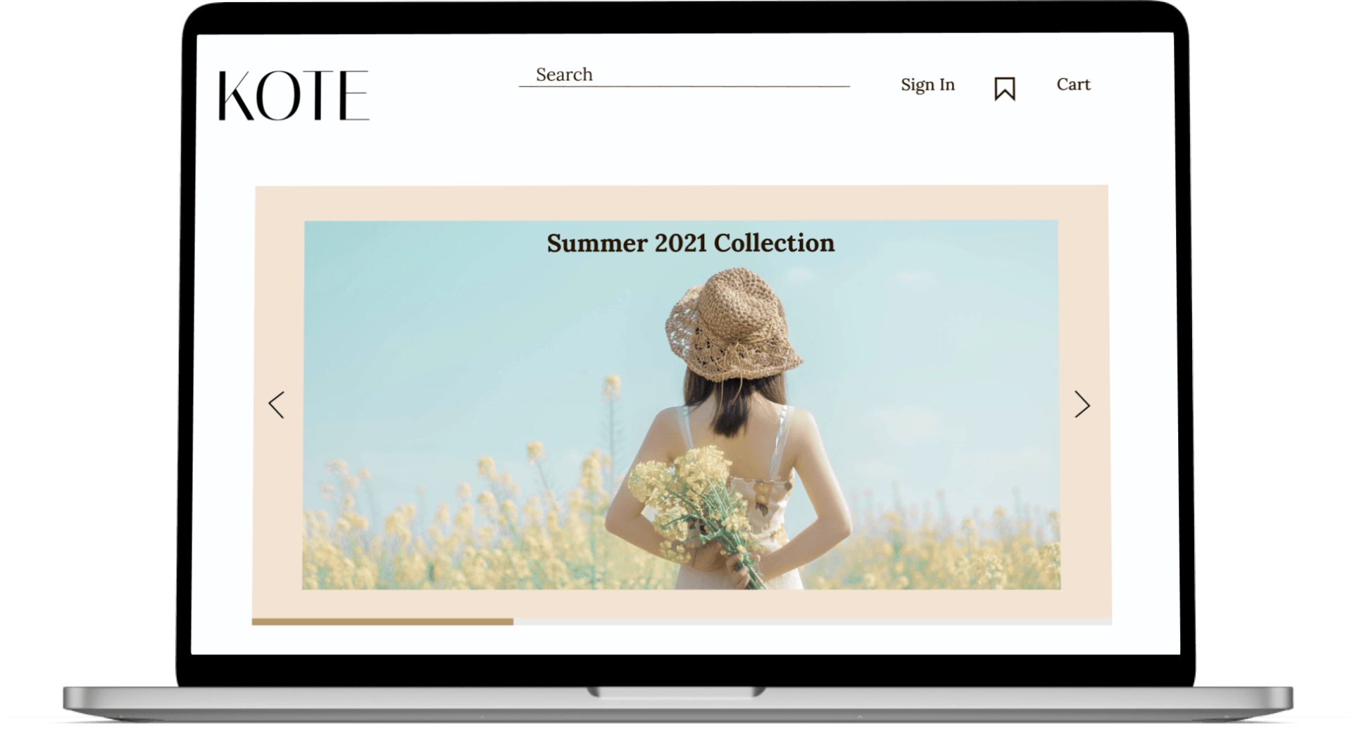
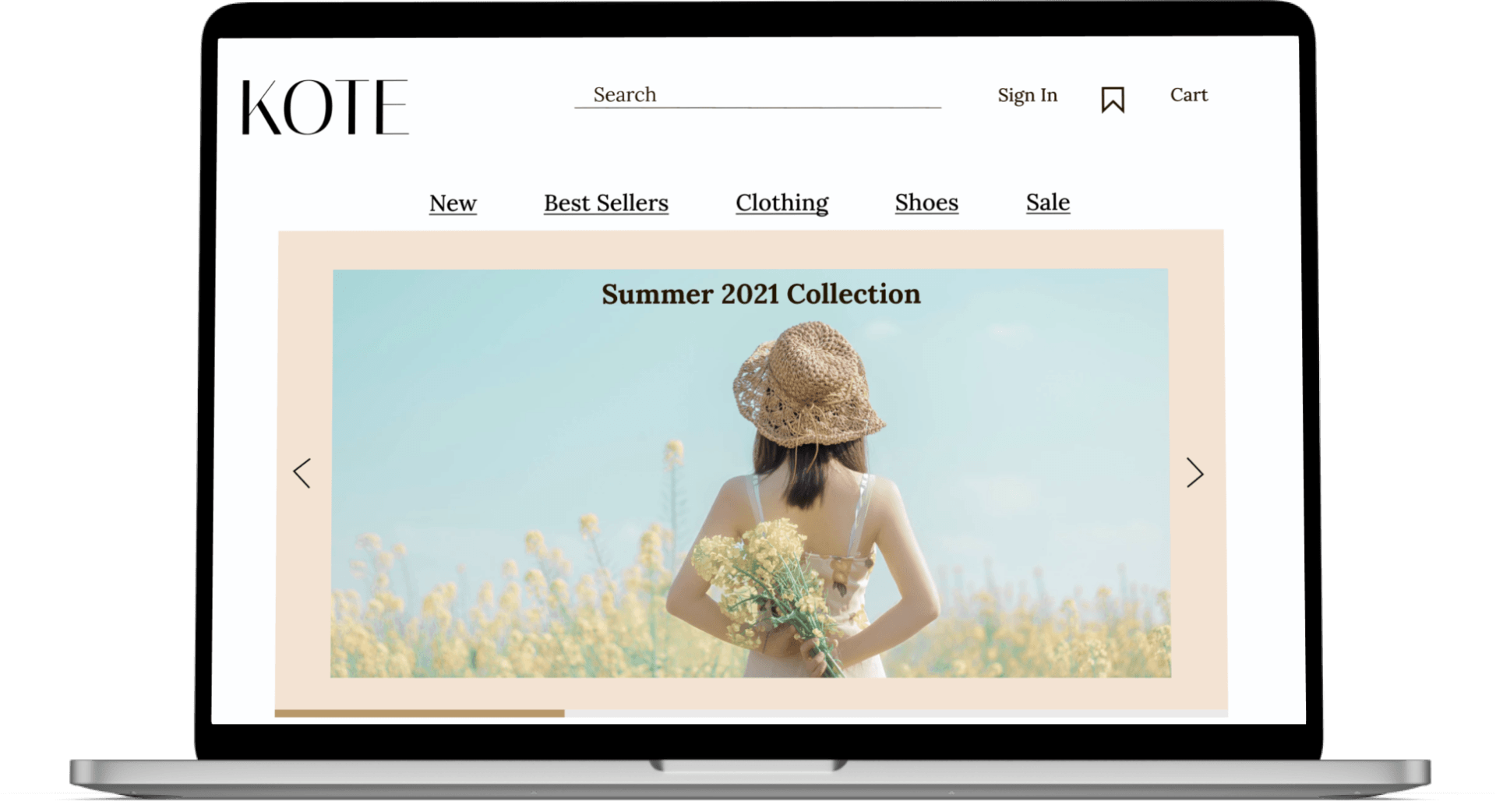
I added and underlined the categories on the home screen to make it more clear they would drop down.
Conclusion
Thoughts
Overall, I would say this product was a success. Everyone was able to complete the task with ease and they had positive feedback on the experience. This was my first time building out a project from start to finish so it was really great insight on all the general steps it takes to complete an e-commerce retail site. It was a great experience seeing people interact with something I built out and reaffirmed my passion for UX design.
Future Considerations
If I had more time to work on this project, I would have liked to build out more user flows and conduct more research with a larger user sample to get more information and ensure my design is easily navigable and intuitive.


