Send a gift in the Nintendo e-Shop
I added a new feature to the Nintendo e-Shop: gifting games directly through the e-Shop
Project Date: August 2021- September 2021
My role: UX/UI Designer, UX Researcher, Wireframe, Prototype
Slide title
Button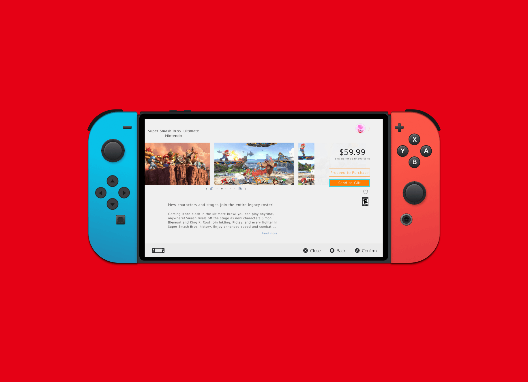
Slide title
Button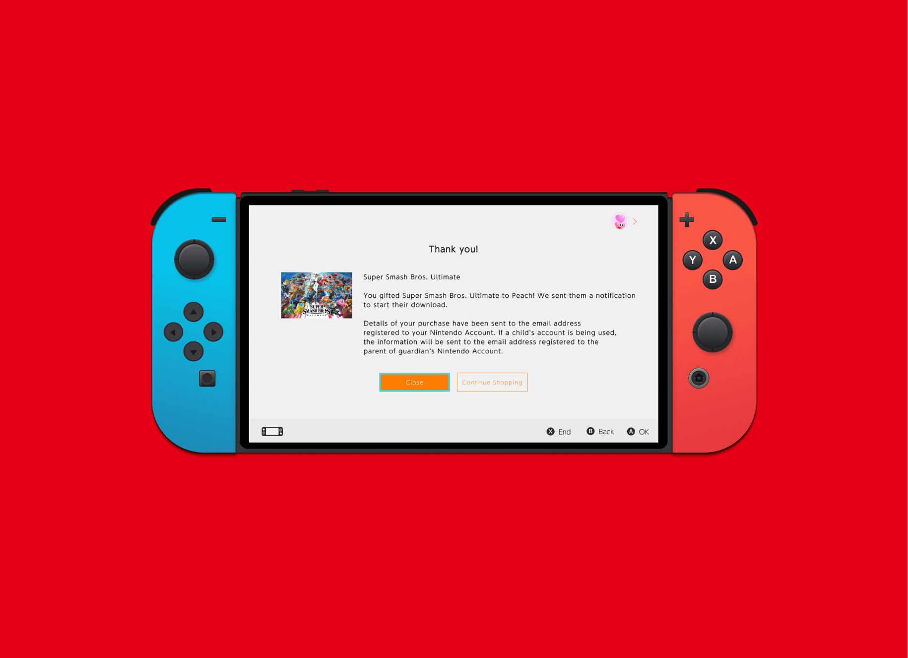
Slide title
Button
About the Project
Nintendo is a world-renowned Japanese consumer electronics and video game company, founded in 1889 as Nintendo Karuta by craftsman Fusajiro Yamauchi and currently headquartered in Kyoto. They promote fun and memorable games to all ages and recently entered the digital gaming sphere to compete with other gaming companies. They have given users the option to buy their games in physical and more recently digital forms.
The Challenge: Create a new feature for the Nintendo e-shop. In this case, I added the feature to gift games directly to users through the shop platform.
Objectives: Offer the option to gift a game to friends and family that would reduce the amount of people having to pay out of pocket and reduce the confusion of knowing how much funds they have leftover from a previous gift card if applicable.
Define
Research Goals
We want to understand if customers would find this feature useful and why. We also wanted to see if this is a standard feature for video game companies to provide to their user base.
Research Objectives
- Understand if customers would find this feature useful.
- How often are customers buying new games?
- What is the process of gifting games directly through the e-Shop?
Methodologies
- Competitor analysis to see what the market has to offer.
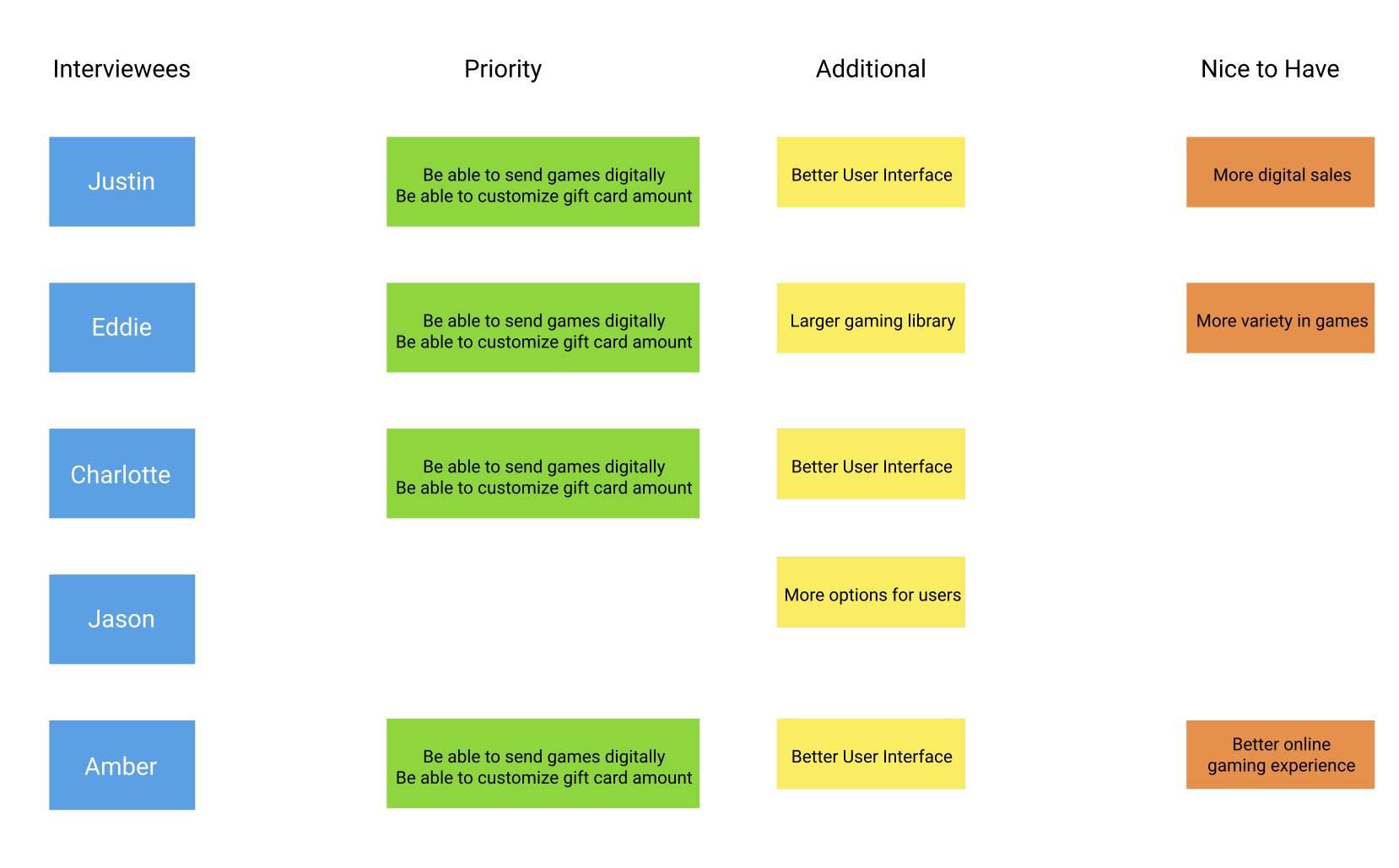
- User Interviews with a target audience to see their perspectives and gain insight on what attracts them to certain companies and their relationship with Nintendo specifically.
- Secondary research from articles and other literature to gain a better understanding of the online video game space and see if there are patterns of success.
Participants
- Males and Females in their mid-20’s who have played video games in the past month.
Assumptions/Risks
- An assumption we can make is that digital downloading is more convenient for many people than buying physical copies of video games. It would also be more convenient to gift games directly to users rather than through pre-set gift card amounts that exist on the Nintendo platform at the current moment.
Secondary Research
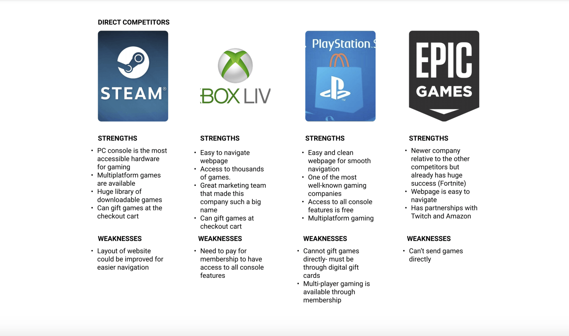
It was important to begin research for Nintendo by understanding its direct competition in order to understand how they have their gifting process set up. I chose companies that have established themselves in the digital gaming space such as X-Box, Playstation, Steam, and Epic Games.
Findings
I found that out of these four companies, only two of them allow direct game gifting. All of these major companies have a large library of games for their users to access but some are more limited to their consoles, such as X-Box and Playstation, rather than the PC sites like Steam and Epic Games.
Takeaways:
- Make the process simple and clear
- Allow users to give to users on their friend list or by their account number
- Allow for users to save products so they can come back and complete their purchase at a later time
User Interviews
The target audience are men and women in their mid to late-20’s that have played video games in the past month.
Findings:
- All participants found the digital download more convenient over purchasing the physical copy.
- All participants said Nintendo had a significant impact on their video game experience since their childhood.
- All participants noted they would use the feature to buy games for their friends and family and it would be more convenient than buying gift cards.
User Persona
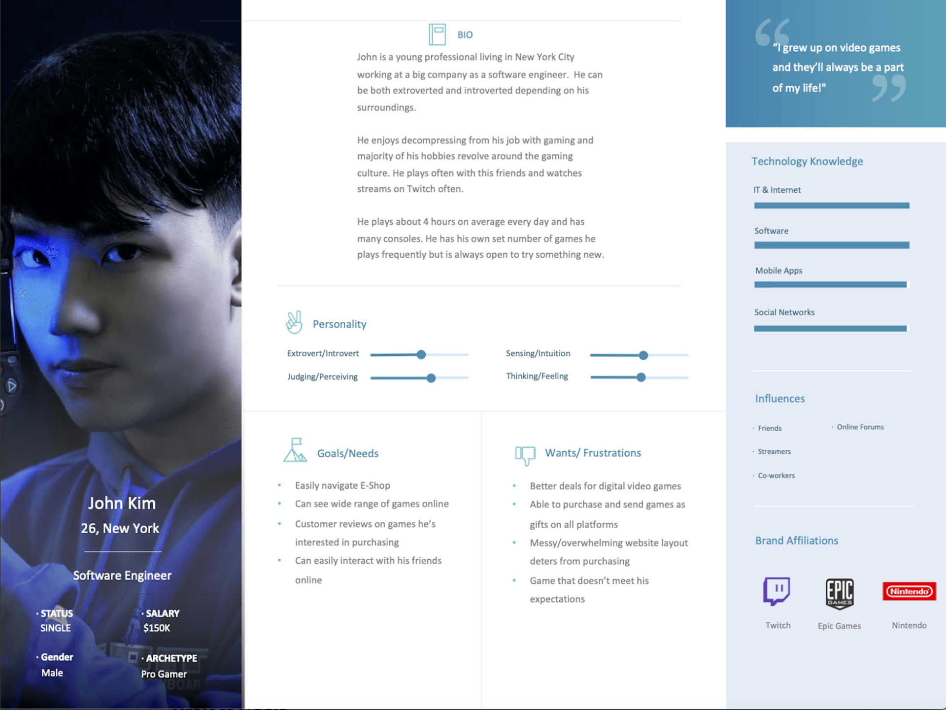
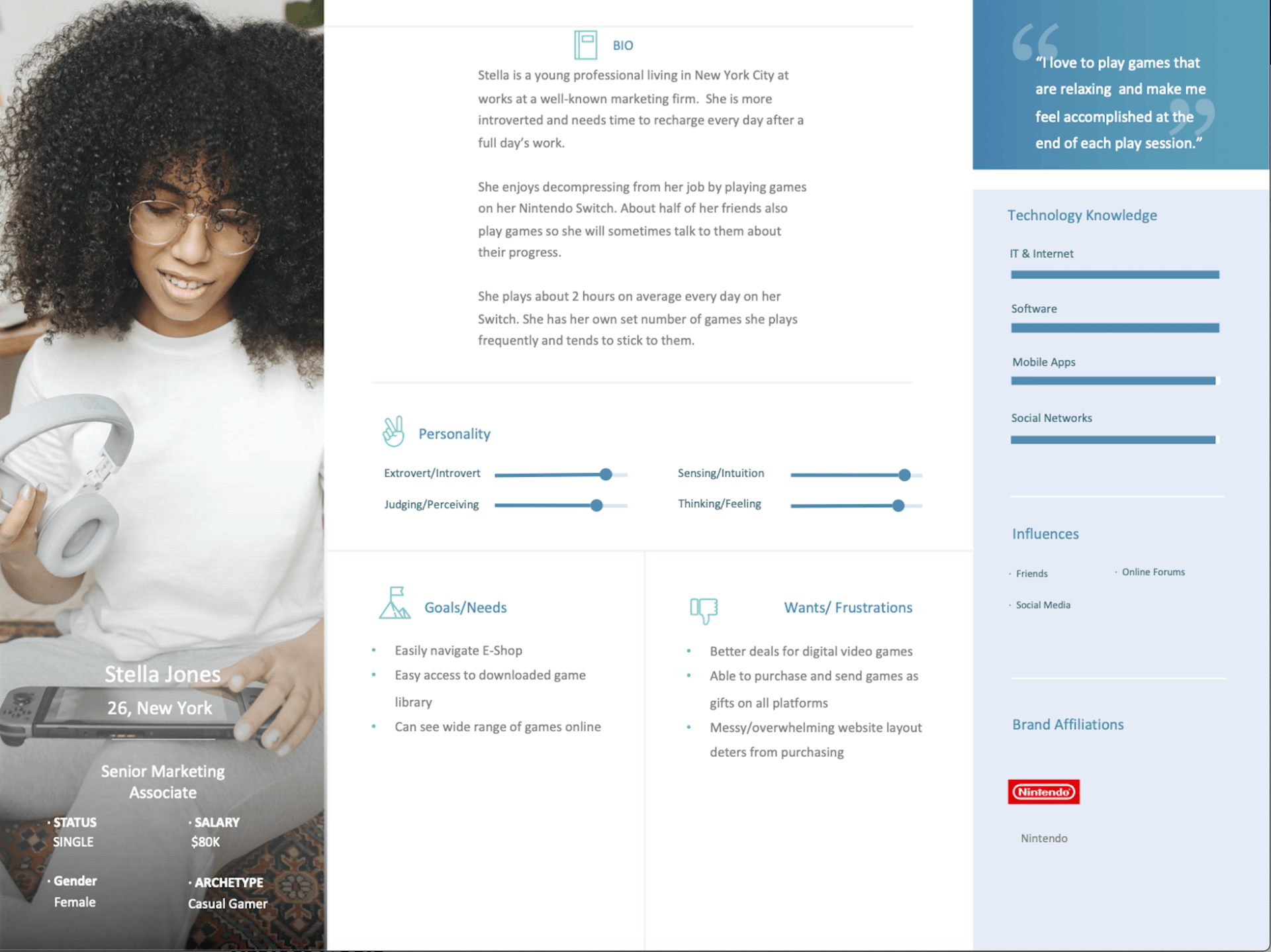
Through the interviews, I was able to narrow down the specifications I needed for two user persona for this project. John is a 26 year old Software Engineer working in New York and video gaming is his main hobby. He is tech-savvy and frequently plays online with his friends. He enjoys easy navigation, wide game selection, and interacting with his friends online. Stella is a Senior Marketing Associate in New York plays video games as a way to de-stress. She is also very tech-savvy and tends to stick to games she already knows. She also enjoys easy navigation and a wide variety of games she can check out.
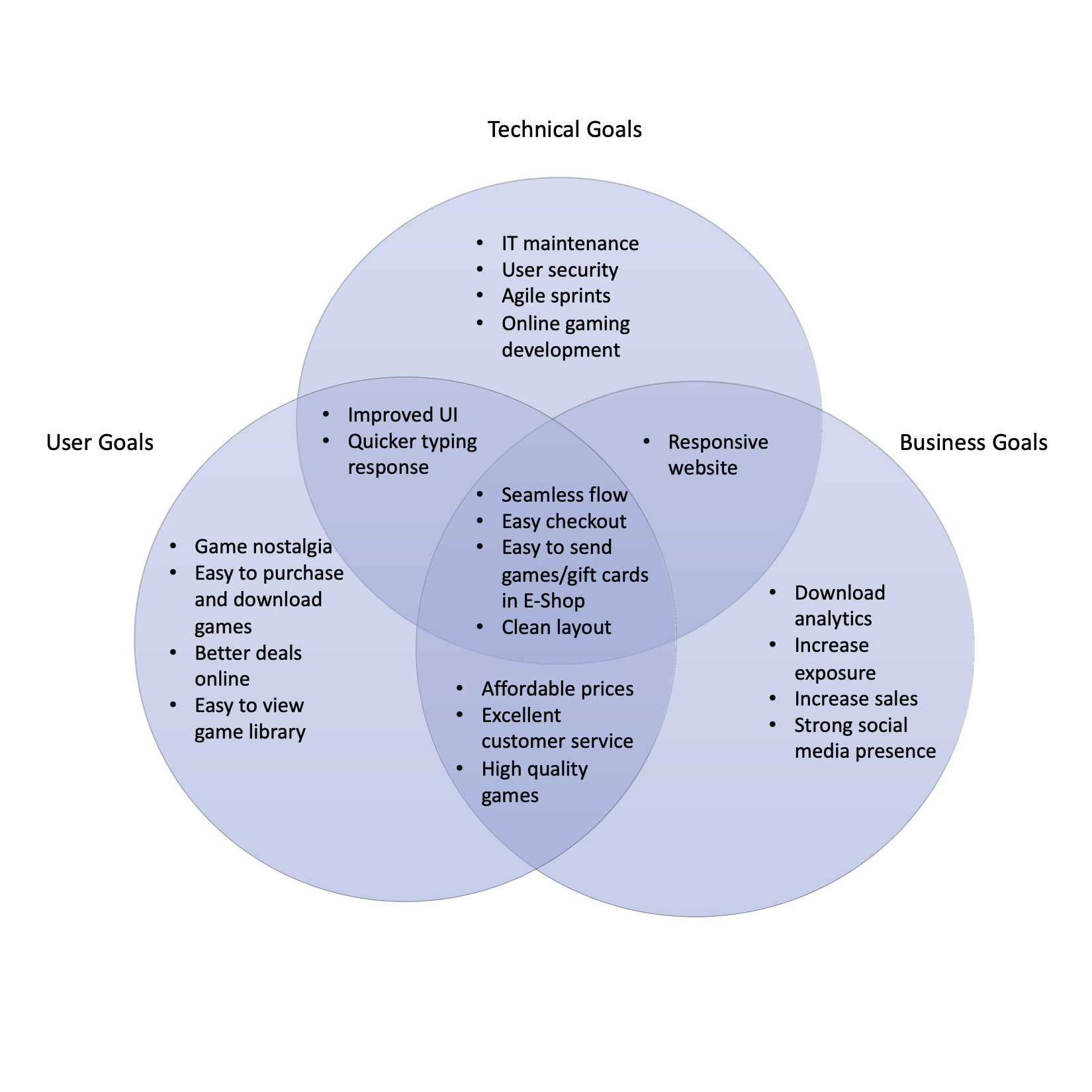
Project Goals
I created project goals to identify where there are similarities, differences, and overlapping goals for the business, user, and technical side of the project. These are important stakeholder information that would define the project so it was essential to have a good understanding of them.
Ideate
Task Flow
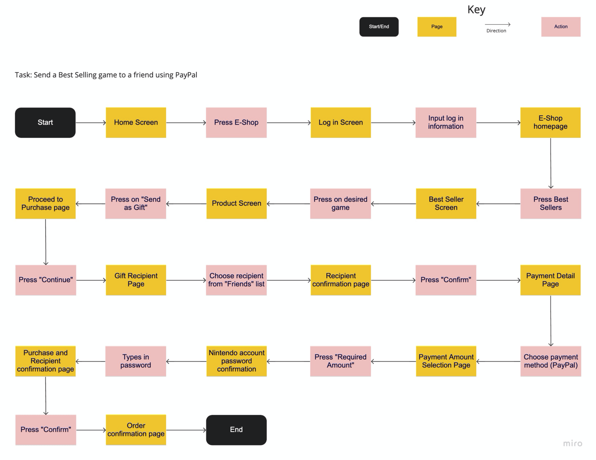
I created a happy path from the home screen to checkout with the task of gifting a Best Selling game to a friend using PayPal.
User Flow
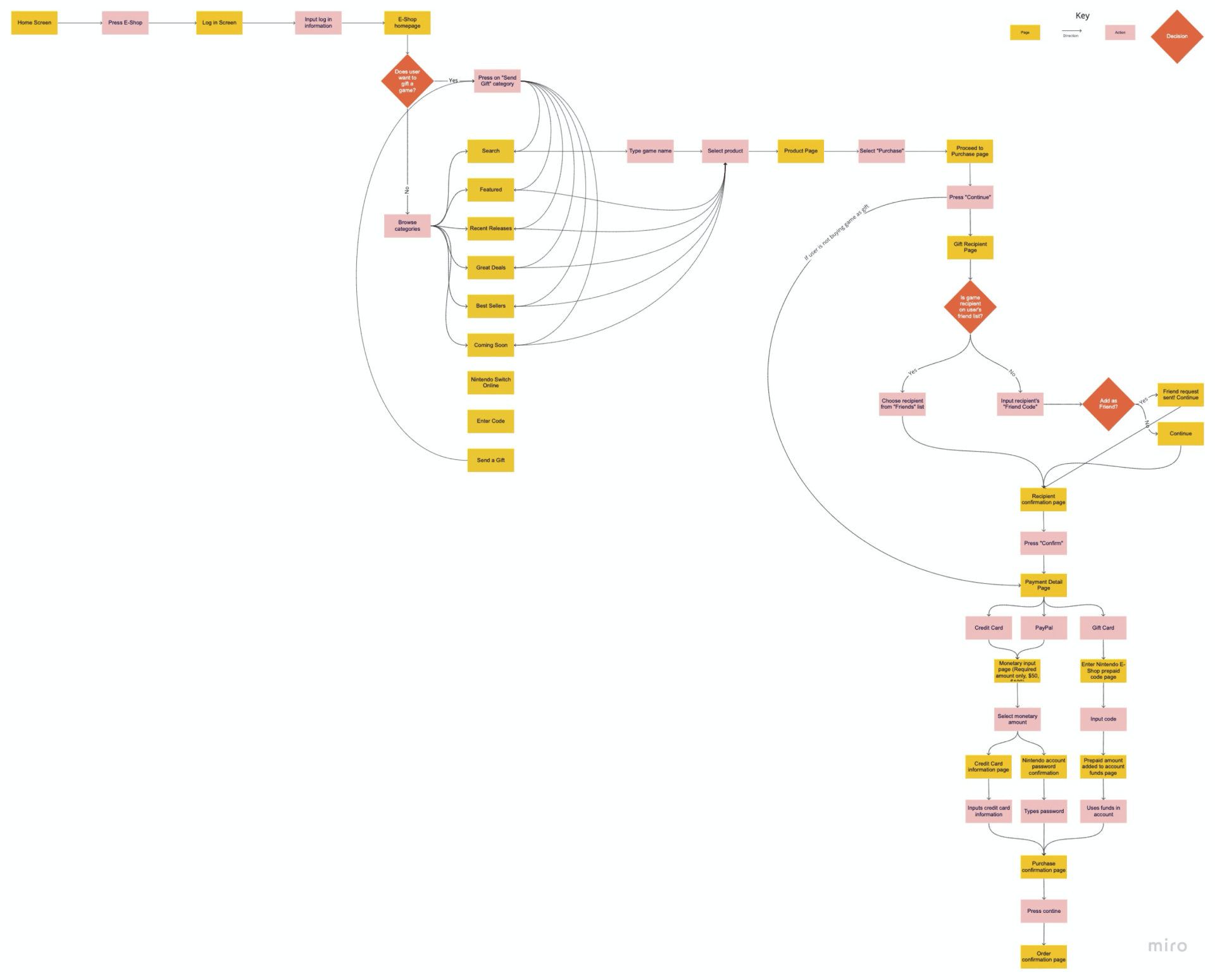
I created a more in-depth user flow on Miro to showcase multiple ways a user would interact with the e-Shop that leads to checkout.
Wireframes
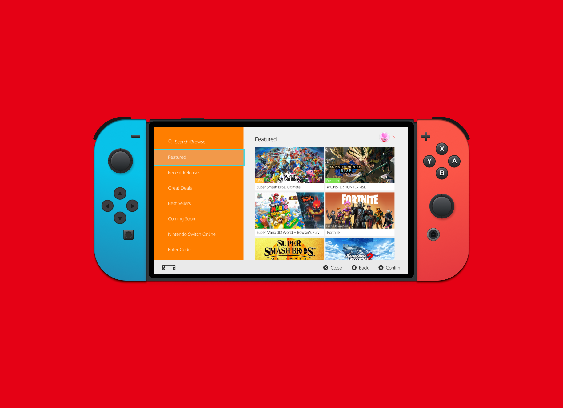
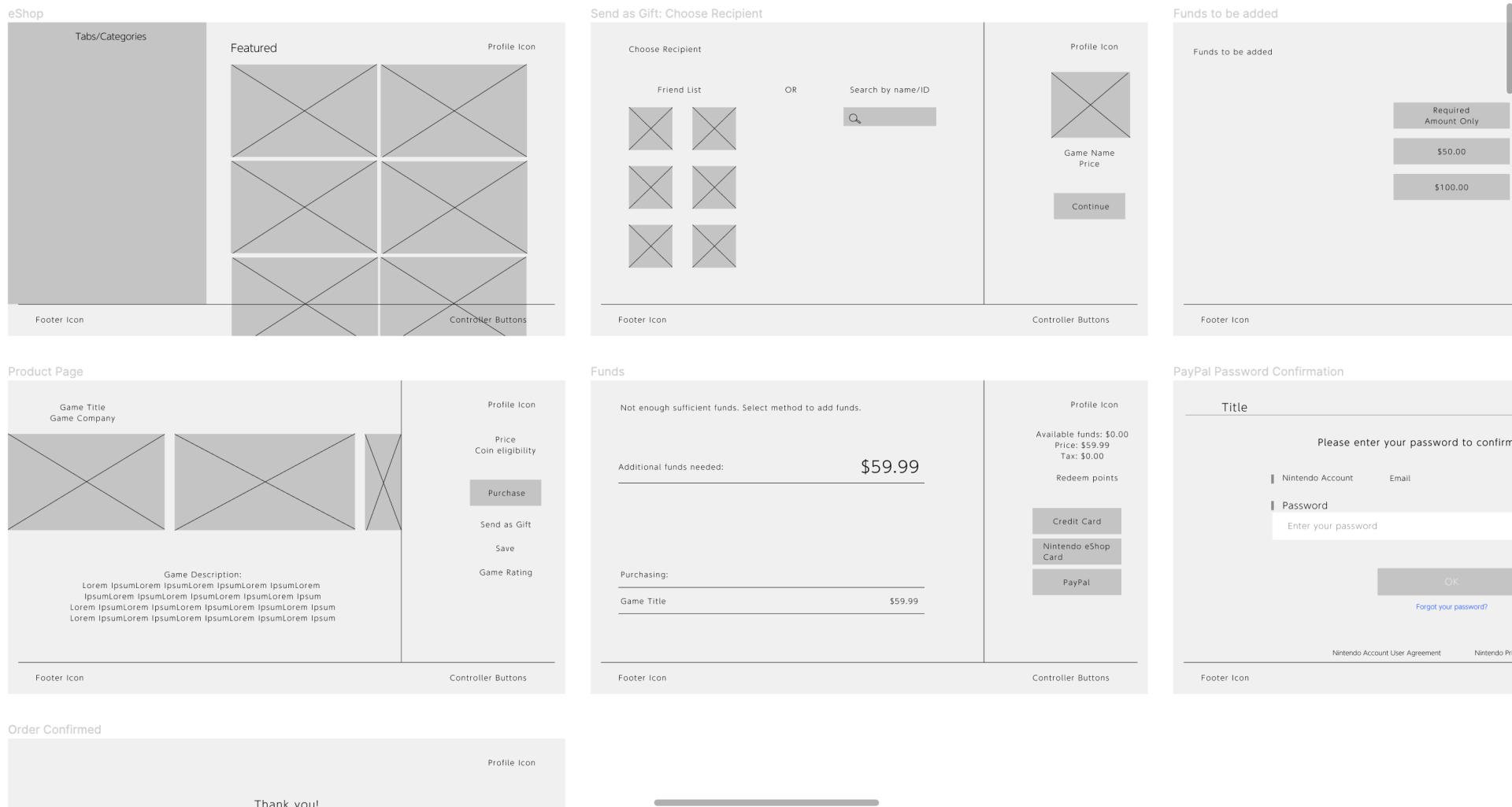
After doing user research, I applied all the new information by creating some low-fidelity wireframes to build out the pages for the new product feature.
Design
Branding
Nintendo is an already established and world-renown brand so I stuck as closely to it as possible when creating this new feature. The objective was to highlight the new feature of gifting games to friends in a way Nintendo could implement it today.
Refining the Design
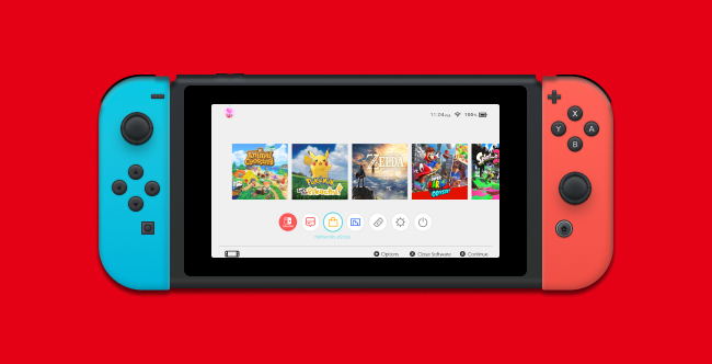
I made the final touches to the wireframes and created a high-fidelity mock up and prototype of the gifting and checkout process feature. You can check it out below!
Prototype
Check it out!
Testing
Usability Testing
With the prototype complete, I needed to confirm the design’s functionality and ease of use. I recruited users in the age range from 20-29 to test out the flow and give their insights. I assigned them the task and to talk about their thought processes aloud while completing the task.
Affinity Map
Based on the feedback provided, I created an affinity map to make the necessary changes to my prototype.
Iterate
Revisions Made
I changed the button outline by making it bolder and a bright blue to stand out against the orange primary button more. This makes the selection stand out more.


I also did the same to the border around the "Recipient" in the Friend List to make the selection clearer.


Conclusions
Thoughts:
Overall, I would say this product was a necessary feature to the platform and the feedback was successful. Everyone was able to complete the task with ease and they had positive feedback on the experience. This was my first time adding a feature to an established system. It was intimidating at first but also fun to create something for a company I personally find joy from. It was a great experience seeing people interact with something I built out and reaffirmed my passion for UX design.
Future Considerations:
If I had more time to work on this project, I would have liked to build out more user flows and conduct more research with a larger user sample to get more information and ensure my design is easily navigable and intuitive.


